Garden Glory, a fresh startup in India with a big idea: bringing the farm to those who live far from it. Right now, it’s hard to find truly fresh veggies. Most are grown using chemicals, which can lead to health problems. But Garden Glory wants to change that. Garden Glory mission to help people grow their own organic, hygienic vegetables at home, right on their terrace. Imagine eating food you’ve grown yourself, knowing it’s healthy and safe. That’s what Garden Glory is all about-making it possible for anyone who cares about a clean lifestyle and good food.

Brand Personality
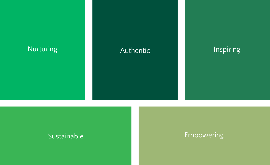
Drawing from the text provided, brand strategy revolves around authenticity, health-consciousness, and sustainability. We’ll infuse the brand with a nurturing personality, reflecting care for both the environment and the well-being of their audience.

Identity Design
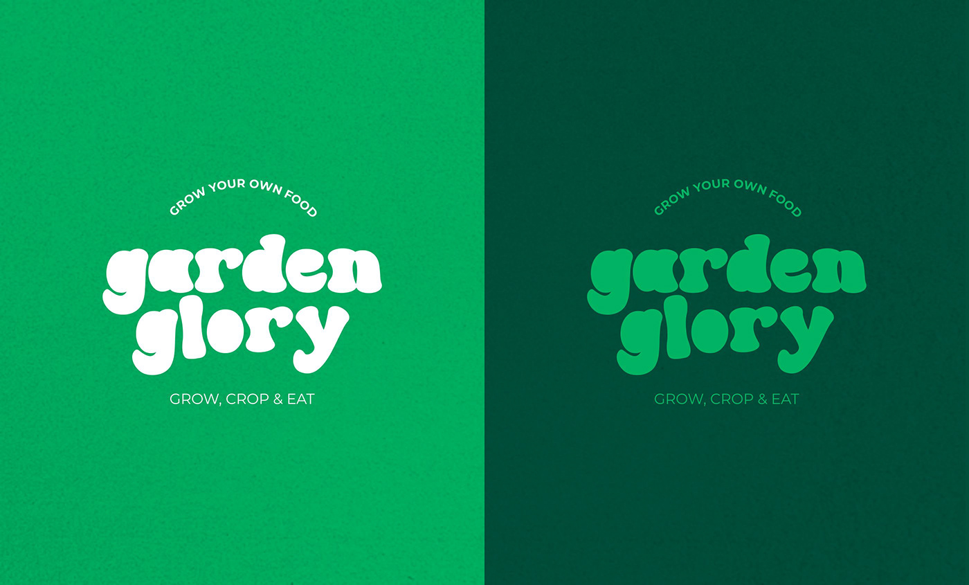
We have developed a unique brand identity that embodies these values at its core. Utilizing a distinctive typography style featuring free-flowing small caps text, we have created a visual representation that exudes boldness and organic charm. For the wordmark, we have selected a fresh green color, symbolizing the brand’s commitment to natural abundance and vitality.
This vibrant hue not only captures the essence of Garden Glory but also evokes feelings of freshness and growth. Through our brand identity design, we aim to evoke a sense of connection to nature, inspire healthy lifestyles, and communicate the brand’s dedication to providing organic, hygienic food solutions.

Brand Tagline
In crafting the brand identity for Garden Glory, I embraced the circular form by incorporating two taglines: “GROW YOUR OWN FOOD” positioned at the top, and “GROW, CROP & EAT” at the bottom. These taglines not only encapsulate the brand’s mission of empowering individuals to cultivate their own fresh produce but also form a cohesive narrative of growth and consumption.
Positioned in a circular layout, they create a visual symmetry that reinforces the cyclical nature of farming and the journey from seed to table. Together, these taglines embody Garden Glory’s commitment to sustainability, health, and the joy of homegrown food.


Typography – Garden Glory employs two distinct typefaces to convey its message effectively. For headings and prominent text, a luxurious serif font is used, evoking elegance and sophistication. In contrast, a clear and modern sans-serif font is employed for body text, ensuring readability and accessibility for viewers.
Colors – Inspired by the natural hues of vegetables, Garden Glory’s color palette exudes freshness and vitality. Fresh green serves as the primary color, symbolizing growth and abundance. Shades of green and tints of fresh green add depth to the palette, while tomato red and capsicum yellow serve as accent colors, infusing warmth and energy into the brand’s visual identity. Together, these colors create a harmonious and natural palette, embodying Garden Glory’s commitment to sustainable living and healthy eating.


Visual Style
In crafting the visual language for Garden Glory, flat vegetable vectors serve as iconic representations of the brand’s commitment to organic, homegrown produce. These vectors not only add a playful and approachable touch to the brand identity but also symbolize the abundance of nature and the joy of gardening. Alongside these elements, typography plays a pivotal role, presented in circular forms to reinforce the cyclical nature of growth and consumption. This circular layout not only creates visual interest but also guides the viewer’s eye in a seamless journey from one element to the next.